UI Revamp
We did a major revamp of the CRIMS UI. We had been working on this for sometime now and we spent time on it to make it more responsive, cleaner and intuitive. Here’s a short description of what has changed. Popups: The popups for Edit Tags, Rename, Share and Delete files have been removed. Instead […]
We did a major revamp of the CRIMS UI. We had been working on this for sometime now and we spent time on it to make it more responsive, cleaner and intuitive. Here’s a short description of what has changed.
Popups:
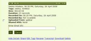
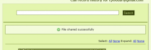
The popups for Edit Tags, Rename, Share and Delete files have been removed. Instead of that we have introduced ‘Edit In Place’ dialog. When you click on these links, a small dialog opens up on the same page to take in the input. Much better than navigating to a different page. Here’s a screen shot of the ‘Share’ operation.
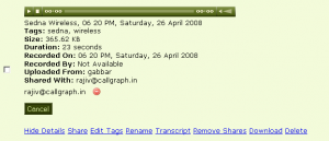
The functionality of removing each share individually has also been added.
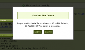
The delete file brings up a modal dialog now. The batch operations also show you a modal dialogs instead of popups.
Widgets:
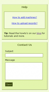
Two new widgets, help and support have been added. They are on all the pages now: Transcripts, Upgrade, Add Machines etc.
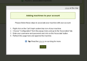
Clicking on the help option brings up the modal dialog now. The help text also has been revamped.
Icons:
Icons have been added to the main message bar on each of the pages. For any action they show the result there. If an error occurss during an operation, the text turns red to alert you.
What’s Next:
Autosuggest, color scheme change and more. Stay tuned.
Do let us know what you think of these changes. And thanks for using Call Graph once again.
Comments (0)
No comments yet. Be the first to share your thoughts!
