UI Changes
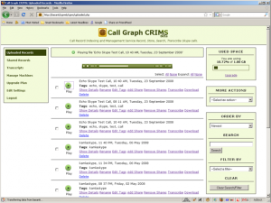
Continuing with the UI changes we had started with our client, we have recently released the first batch of UI changes for our web service. In brief, the colors have changed, the the menu has been rearranged, the sidebars have been tweaked and the pages have been optimized to load faster. Color Combination: We have […]
Continuing with the UI changes we had started with our client, we have recently released the first batch of UI changes for our web service. In brief, the colors have changed, the the menu has been rearranged, the sidebars have been tweaked and the pages have been optimized to load faster.
Color Combination:
We have completely done away with the dark green background. It has been replaced with a white now. The main area of every page has a white background while the menu and sidebars are light green. The text is now black on all the pages.
Menu Changes:
The Call Record History page has been renamed to ‘Uploaded Records’. The support page has been removed. We have introduced help widgets on the sidebar to replace the functionality.
Uploaded Records:
This page lists all the records that have been uploaded from the Call Graph client. The listing is now identical to the one in the Client UI. The flash player has been replaced with a button which in turn launches the flash player when its clicked. A progress bar is now displayed before the flash player appears which makes the play function instant. Earlier there used to be a delay between the time when the play button was clicked and the file started playing.
The shared records listing has also been changed in a similar way.
Sidebar:
The sidebar also has undergone a revamp. On the uploaded records and shared records page, the Order By, Search and Filter options have been grouped into a single box. This is to indicate that these options can be combined with each other while trying to locate a particular record. The search earlier used to be at the top of the page.
Whats Next:
Tighter integration with the Client UI, sharing, transcribing directly from the client etc. Stay tuned.
Let us kwow that you think of the new color combination and the changes. Things should be much faster and responsive than earlier now.
Comments (0)
No comments yet. Be the first to share your thoughts!
