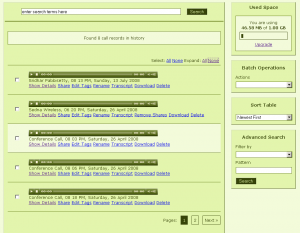
As mentioned in the last post, the recent change to our UI had increased the clutter on the call record history page. So today we cleared it up. The result is this.
Only the flash player, name of the file and manage options are displayed initially and the details are hidden from the view. Clicking on the ‘Show Details’ reveals the details of the call record. The view can be toggled to show or hide.
Also the current record your cursor is on is highlighted as you move along the page.
Notice the two new items at the top of the page to expand/collapse the details of all the records in one shot. The select all/none has also been moved from the actions widget to here.
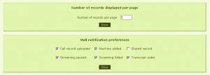
This small change has enabled us to do a lot more with the UI. So now you can also set the number of records that are displayed per page. The setting is on the settings page. The default value is 10 but it can be changed to any value you wish.
Another small change was control on the mail notifications that CRIMS sends. It can be turned on or off from the settings page. Here’s a screenshot.
So how does this look? We hope its better than before, but please let us know if it isnt.
The next thing in line is to remove the popup when managing your call records. So stay tuned.


